1. Overview
Course prerequisite: the logical structure and content of the PowerPoint have already been worked out and written.
The course enhances the expressiveness of PowerPoint mainly through the following six parts:
- Color
- Text
- Shapes
- Charts
- Slide Master
- Animation
2. Color
2.1 Understanding Color
- Hue
Chromatic colors, such as purple, cyan, magenta, etc. Neutral colors, such as black, white, and gray.
- Brightness
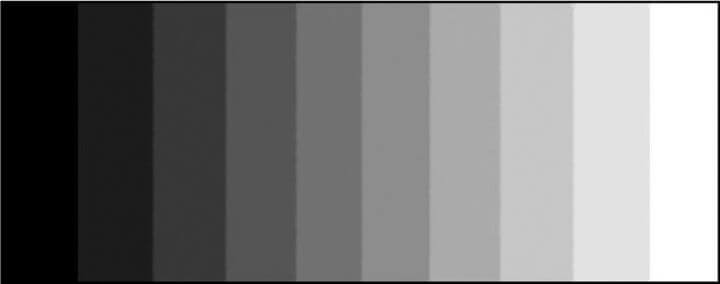
The degree of light and dark of a color; the higher the brightness value, the whiter the color, and the lower the brightness, the blacker the color.
- Contrast
It is the ratio of black to white in the image, and the larger the ratio, the more gradation levels from black to white. The larger the ratio, the more gradation levels from black to white, and thus the richer the color expression.
- Color Temperature
Color temperature is the color bias of light. The lower the color temperature value, the more it leans toward red (warmer); the higher the value, the more it leans toward blue (cooler).
- Saturation
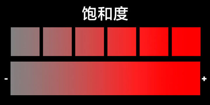
The purity of a color; the higher the saturation, the purer and more intense the color, and the lower the saturation, the grayer and lighter the color becomes.
- Color Wheel
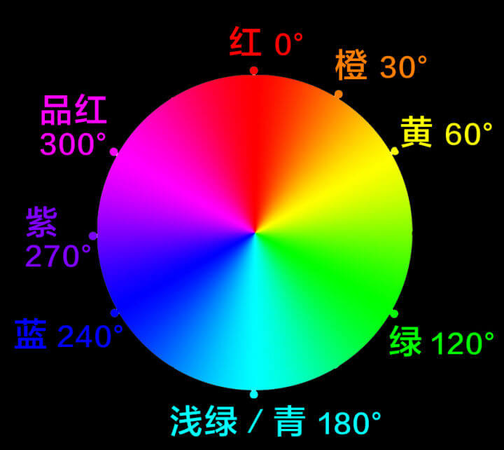
Essentially it is the long strip of color sequence seen in the chromatic spectrum, simply joined end to end so that red connects to purple at the other end. The color wheel usually includes 12 different colors.
- Tone
Under illumination by a light source color of a certain hue and brightness, the surface of an object is enveloped in a unified color tendency and color atmosphere; this unified atmosphere is the tone.
2.2 Color Matching
You can make use of a tool such as Adobe color-wheel.
- Monochromatic + neutral colors
- Pick colors within a 90-degree range on the color wheel
- Complementary color, the color 180 degrees opposite on the color wheel
- Split complementary: first find the opposite color, then find two other colors within a 90-degree range, for a three-color combination
- Primary color combination, red yellow blue
2.3 PowerPoint Color Scheme Steps
Choose the base color — one
A color that positions the main visual; usually a logo color or a color you likeFind an accent color — one
Mainly used to highlight key content; usually a split complementary of the base color (90-160 degree range)Same color family — three
Mainly used to enrich the color layers; usually analogous/same colors (0-30 degree range)Neutral colors — three
General content and most of the area are filled with neutral colors, usually black, white, and gray
Color Matching Tips:
- Use the base color well, use neutral colors more, and use accent colors sparingly
- The base color is the main color; use it where it matters most
- Use neutral colors extensively, especially for text
- Use accent colors only for emphasis
- No more than 3 hues
- Not enough colors? Cleverly use tones within the same color family
3. Text
- Font
On a projection screen you should use sans-serif typefaces more, such as SimHei, Microsoft YaHei, etc. — they are easy to read and the glyphs have no decoration. Use WordArt styles with caution.
- Size
Do not use a font size smaller than 16 pt in a PPT
- Text Properties
Text can also have a background image set to enhance its expressiveness
- Text Layout Principles
- Proximity (related content is grouped together to form a visual unit; unrelated visual units should be separated)
- Alignment (use the same alignment within a visual unit as much as possible; avoid center alignment)
- Repetition (keep fonts and spacing consistent to increase visual unity)
- Contrast (for emphasis; few but precise)
Tips: (1) If there is an image, keep the image on the left and the text on the right as much as possible. This is because the human eye looks at images first, and reads from left to right and top to bottom. (2) On a single PPT slide, keep the content points to no more than 3 or 5.
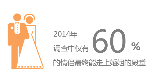
- Emphasizing Content
- Recommended: make it larger and bold, reduce line breaks, change color for contrast, and use moderate animation.
- Not recommended: underline, italics, shadow, excessive animation
4. Shapes
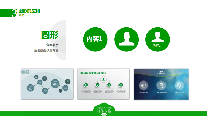
- Circle
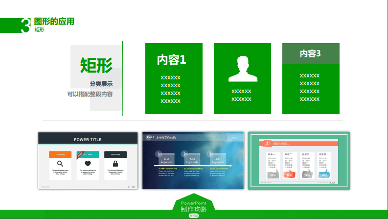
- Rectangle
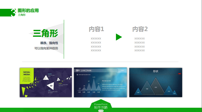
- Triangle
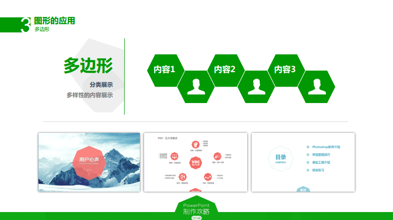
- Polygon
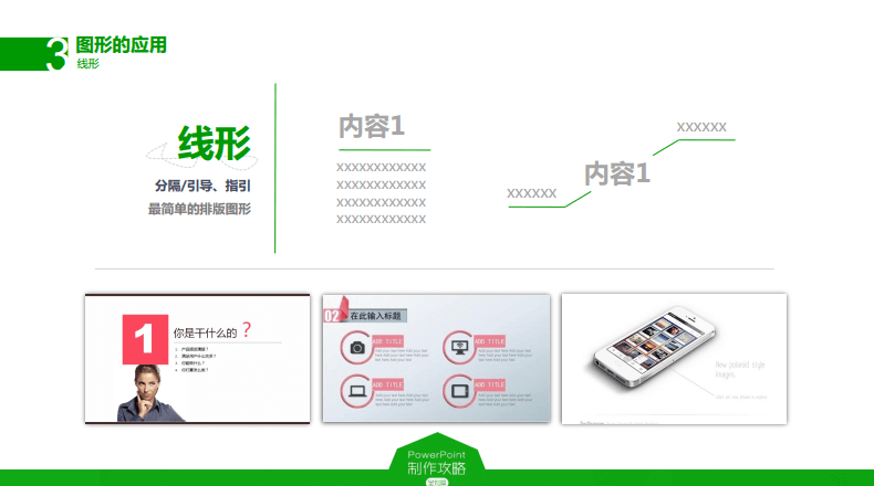
- Line
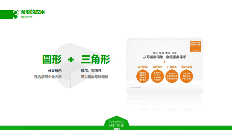
- Shape combination: circle + triangle
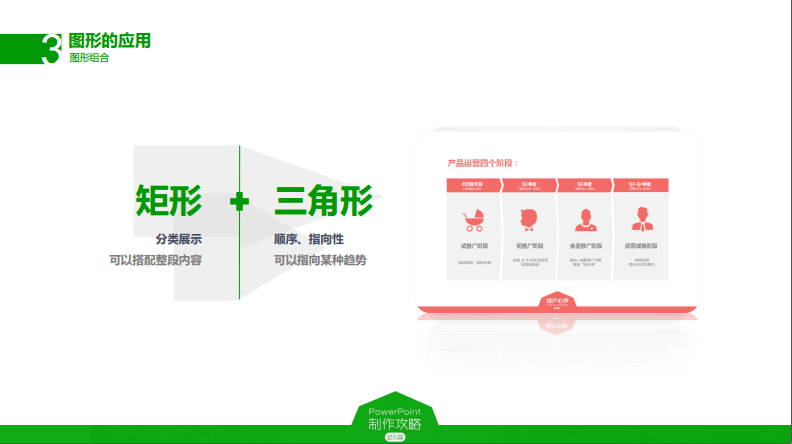
- Shape combination: rectangle + triangle
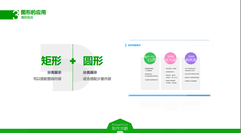
- Shape combination: rectangle + circle
- Shape combination: circle + line
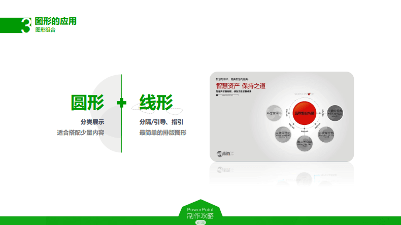
An image is worth 1000 words. After distilling the keywords, looking for interesting, creative, high-definition images that set off the theme is a good choice.
Here are some image sources:
Finally, you also need to master some image-editing techniques in PowerPoint.
5. Charts
Chart design is divided into three steps:
Step 1: Generate the chart
Generate a basic chart from the data and fine-tune the detailsStep 2: Beautify the chart
Refine the chart elements, remove useless elements, and make the chart’s information clearerStep 3: Emphasize the chart
- Emphasize with a color change
- Separate key data from ordinary data
- Use animation effects to emphasize key data
- Use images to highlight the presentation in context
Here are some chart presentation effects:
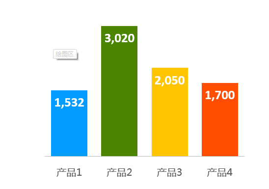
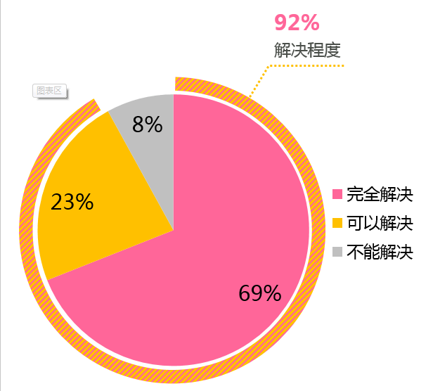
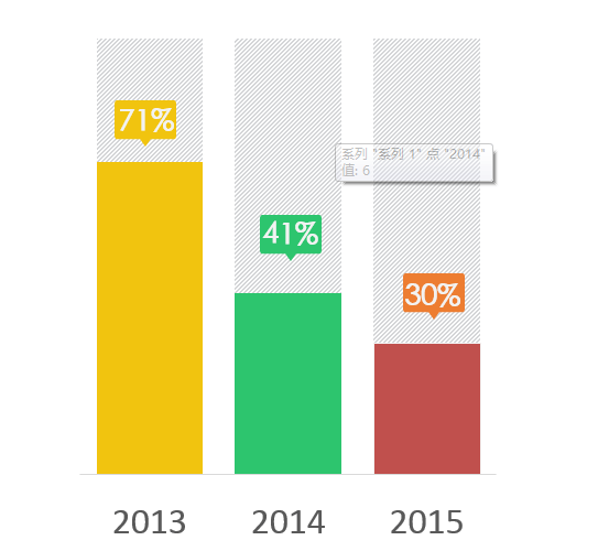
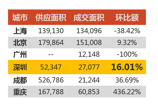
There are also some techniques for drawing charts by hand, using basic PowerPoint shapes to combine into the icon forms you need.
6. Slide Master
Usually the Slide Master only needs to define the top and bottom styles, title style, and font style that every page shares. The specific layout of each page needs to be adjusted according to the content.
7. Animation
You need to control the degree to which you use animation; do not let it steal the show. Learn some techniques for creating PowerPoint animations.
